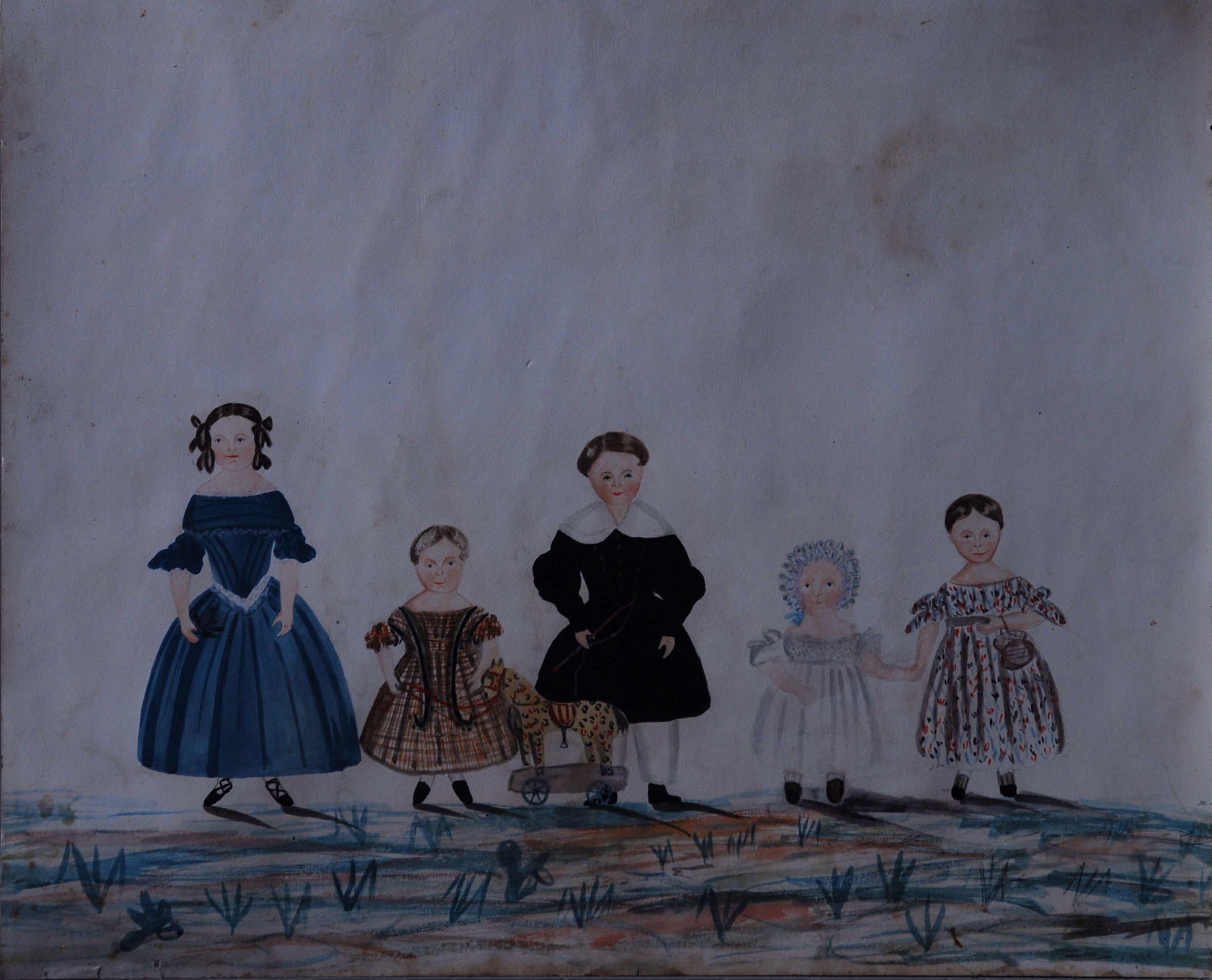
 I couldn’t resist this watercolour when I saw it: there is something incredibly appealing about the five of them standing there in a row, waiting for their portrait to be painted (I imagine they probably didn’t stand still for long), and feeling very important and special as children do even now when they are waiting for their photograph to be taken. You can just imagine the youngest one needing to have her hand held and them all wanting the toy horse to be included, except perhaps the oldest, who looks as though she may want to distance herself ever so slightly from it all. Whoever owned this was as proud, because the vivid colours suggest that it has been carefully put away for much of its life. Sometimes you find inscriptions on the back of paintings of children recording their names and ages and, although there is nothing on this, the image is so strong that you get a real sense of this family without needing to know anything else about them.
For me this is the power of ‘naive’ art, the very immediate connection with ordinary people who wanted to record something in their lives that was very special, whether children, dogs or farm animals. This was not meant to be high art, but were paintings done by journeymen artists as records of people’s lives until this gradually died out during the 19th century, to be replaced by photography. If you think of those early photographs of Victorian men and women standing stiff and straight before the camera it’s the same: everyone likes to feel special.
My Intern
 ‘Since my first visit to the shop a few months ago my perceptions of it have changed greatly; from working here I have seen how the display and changeover of stock is a well thought out process: something which has a greater than expected affect on the way in which a buyer interacts with their surroundings. The space available at Town House means that not only is it an antiques shop in the most obvious sense, but it is an experience to walk around – you enter the first room, a showroom, and from here you discover the basement kitchen, a place where the objects for sale surround you as they would if they were part of the original kitchen. However, one thing that stops Town House from existing solely as a shop is the gallery space beyond the courtyard outside. During my time here it has housed three artists’ exhibitions and served as a showroom for paintings and studio pottery for sale. The versatility of this space and how it adapts for each purpose is demonstrative of the way in which the shop is able to stay up to date with its surroundings and within the changing climate of the antiques trade.
This internship has shown me that the antiques trade is ever-changing and, arguably, in decline. However, it has also taught me how enjoyable it can be – the process of discovering something rare or valuable is extremely rewarding, not for the value of that object, but for the sense of achievement it brings with it. Fiona’s extensive knowledge and passion for her business and the month long exposure to the trade has taught me a lot.’
L’Oeil du Decorateur
 I have been buying 50’s and 60’s books on design and decoration recently because I find the photos incredibly appealing. The slightly sparse interiors mixing modern art with antiques, the use of strong monobloc colours and a feeling of modern geometric forms all seem to be exactly ‘the look’ that has been around in the interior design magazines since things moved on from white minimalism. This photo is from ‘L’Oeil du Decorateur’ published as part of a series in 1963 and looking through it has made me realise how much of interior design we see around us now is prompted by re-visiting the past for inspiration. This shouldn’t be a surprise I suppose, if you look back at 19th century it’s littered with updates of old ideas: the Egyptian revival, Chippendale revival and Tudorbethan styles are all examples, but I think now we tend to associate the word design with innovation so it’s a surprise to discover how strong an influence the past can still have. Maybe it’s a comfort blanket, something easy and familiar as a respite from the shock of the new. Whatever the reason I love how modern some of these 50’s and 60’s interiors feel.
Gaudy Welsh China
 One day, going shopping in Islington, I passed a small shop that I had no idea existed. It was shut, but some china in the window caught my eye and, although I don’t know much at all about 19th century china, it hooked me sufficiently that I returned the next day. This time it was open and I was told that the china that had taken my fancy was some ‘gaudy welsh’. You may well have heard of it, but I hadn’t and it seemed an unusual use of the word ‘gaudy’, so I looked it up. It originally meant ‘brilliantly fine or gay, showy’ and although it has now come to have the sense of being overdone and tasteless, the original word immediately struck me as completely appropriate: the joy the artist had so obviously taken in the painting of the design made the tulips dance across the surface of the china.
It turned out that the shop was closing down that day, so if I hadn’t been so determined to go back the day after I had seen it, I would have missed my ‘gaudy welsh’; I took that as a sign and kept one piece for myself.
Laura Knight
 This is by Laura Knight who is exhibiting her ‘Pottery Marks’ at Town House from 17 November – 3 December. I like the way she takes something old which has been in ordinary daily use for sufficient time that people take it for granted, eating off their willow pattern plates without thinking about it, and she takes it, turns it round in her hands and considers it, making us stop and look anew. Because we see something every day, it is easy to overlook the beauty of it: familiarity breeds not quite contempt, but perhaps indifference and it is good to be made to open our eyes to the freshness of that original design. In particular it’s difficult, perhaps, to appreciate how exciting the arrival of Chinese art and design was for Europeans in the mid eighteenth century and interesting to see how those new currents that influenced Chambers and Chippendale were then appropriated for general use, inevitably acquiring their own popular stamp. Laura brings it full circle making us appreciate the force of that original design.
Pottery Marks by Laura Knight at Town House.
18 November – 3 December 2011
Tuesday – Sunday 11.30 – 6
Private View 17 November 6 – 9
for our freedom years
 Kerry and Gemma approached me with their idea for this exhibition earlier in the year and I was intrigued by the idea of the juxtaposition between old and new and the idea of a walk in Cabinet of Curiosities.
This is what Kerry and Gemma have to say about For Our Freedom Years, currently on at Town House
‘for our freedom years is a reaction to womens’ ‘culture’, to the idea that as women we share the same ideals, beliefs, ethos and problems, fundamentally the same identity. An identity that is expected and in many cases embraced by many females in today’s mainstream society. The name, of both the exhibition and collective, stemmed from a well known glossy womens’ magazine whose aim is to guide us through our ‘freedom years’. They want to be a friend to young British women who ‘shop when they want, go clubbing when they want and they don’t have millstones like mortgages and kids around their necks’. This doesn’t feel particularly relevant to us, part of their target audience, who can’t quite comprehend why our freedom must disappear.
This exhibition will draw upon and utilize our own experiences as women in order to re-evaluate the notions of femininity. The show will be held in Town House, a homely antiques dealership where the work will interact with the objects and space, transforming it into a collection of female oddities. We have worked with the atmosphere of Townhouse in order to create an installation, where the antiques and art interact, the anti white walled gallery. The space will become a part of the work, creating a walk through cabinet of curiosities.
for our freedom years was curated by Gemma Donovan and Kerry Clark, with the intention of creating a platform for discussion surrounding the way females position themselves within contemporary culture. Both of the artists work with the stereotypes of women and how they view themselves within them. This show hopes to create a network with individuals who share our ideals, rather than those ideals placed on us by popular culture.’
for our freedom years Gemma Donovan and Kerry Clark at Town House
28 October – 11 November
private view 28 November 6 – 9pm
Tuesday – Saturday 11.30 – 6.00
Sofa
 This is a sofa that I have had made recently, an exact copy of a mid 18th century one. This is not something that I usually do, but when the original was briefly in the shop so many people loved it that I decided to have a go. The frame was made as an exact copy even the decoration on the legs was hand-carved. The upholstery was also done in the traditional way, by 7Upholstery in Redchurch Street. I put the mid 20th century African (Mali?), textile on it in the shop by accident, but really liked the combination so I left it there, somehow it brings out the modernity of those sweeping arms.
Orely soaps
 At a market in France in September the perfume of these soaps drew me to Aurelie’s stall, the lady who makes them. In response to the many questions I asked about her soaps she invited me to her home in the depths of the French countryside to watch some soap being made. Aurelie is a typically vivacious young French woman and to her audience of four people she gave an extraordinarily passionate demonstration of how they are made, which was more reminiscent of the very best of the TV chefs than of what you would expect of soap-making. If she had scraped the pan with a spoon and offered it to us to lick I think we would all have done so without thinking, such was the sensory appeal of the smell of the herbs and oils and the vision of the thick dark chocolate-coloured mixture with swirls the colour of cream!
Orely soap (she has changed the name to make it easier), is in the shop now price £4.90, with lots of wonderful perfumes: lavender and geranium, orange and cinnamon and honey and almond…..